


About The Project
Role: Senior UX Designer & Research Lead
Platform: Euler, a DeFi lending and borrowing solution
Objective: Create a seamless, intuitive user experience for a platform handling $300M+ in monthly volume
Team & Timeline: Collaborated with a cross-functional team (2 Product Managers, 4 Engineers, 1 QA Specialist) over a 6-month development cycle

Problem Statement
“A lot of the users of the Euler platform struggle with the complexity of DeFi lending and borrowing workflows, lewhich resulted to a high drop-off rate and reduced platform engagement.”
Goals & Success Metrics
Before I even started the user research at all, I planned and executed a comprehensive workshop with the team to identify the goals of the user research and to help identify the problem statement and proposed solution, which were set as follows:
Enhance Onboarding: I had discovered through Google Analytics installed on the website that a high percentage of users using the platform dropped off very early on. So the first goal was to reduce new-user confusion and abandonment by at least 30%.
Improve Usability: The next step was to ensure we increase successful lending/borrowing transactions by 20%. Some users that did not drop off from the landing page usually exited the website at the stage. When trying to execute a trade, they face difficulties and abandon the process entirely.
Boost Retention: We needed to ensure users kept coming back, so in collaboration with the marketing team, the goal here was to measure usage frequency and aim for a 10% uptick in returning weekly active users.
Solidifying these goals ensured that the entire team was aligned on user-centric outcomes rather than just feature outputs.


Bringing Ideas to Life
Low-Fidelity Wireframes—I created quick wireframes showcasing a clean, minimal UI. Mapped out essential screens for onboarding, lending, borrowing, and managing loans. I also focused heavily on navigation clarity and information hierarchy to reduce cognitive load.
Mid-Fidelity Mockups—I introduced visual design elements (colors, iconography) aligned with DeFi norms but less intimidating. Also incorporated basic tooltips and pop-ups for user guidance.
High-Fidelity Prototypes—Next was building a clickable Figma prototype to simulate real user flows, complete with interactive tutorials. Added a dark mode for advanced users, reflecting community feedback on typical crypto interfaces.

After the first round of user tests, 60% of testers found the text input fields on mobile cramped. We expanded the tap areas and simplified the top navigation bar to improve accessibility, resulting in 25% faster transaction completion rates on mobile in subsequent tests.
Test & Refine: Iterative Usability Analysis
Round 1: Conducted remote moderated sessions with 8 participants with the first iteration of the design. Gathered feedback on overall navigation, clarity, and trust signals.
Round 2: Implemented design tweaks (e.g., extended tooltips, reorganized data visuals) and ran A/B tests comparing advanced vs. simplified layouts.
User Feedback: “The new interface is so much easier to navigate—it finally feels like I’m in control of my funds, rather than the interface controlling me.”


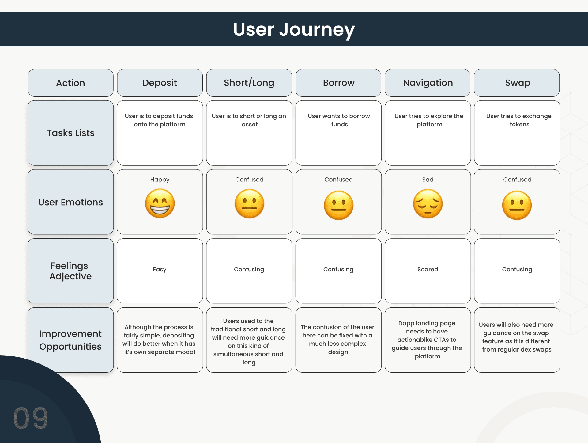
Kickoff & User Research
After I joined the Euler project, my primary focus was to bridge the gap between the advanced capabilities of decentralized finance (DeFi) and an intuitive user journey, and to accomplish this, it was important to establish a deep understanding of our user base.
I conducted a series of 12 in-depth interviews with both novice and seasoned DeFi users. We also ran 2 online surveys that gathered feedback from over 200 respondents. Sourcing this feedback was from the community… I sent a message in the Discord announcement server, and we got lots of our users that showed interest to participate in the ux research.

Some of our partners with a large financial stake in the platform also offered to participate in the one-on-one interiews so we had a very rich pool for our main two user groups. There were four main highlights from the UX research:


Brainstorming User-Centered Solutions
Using the user insights as a source of truth, I led co-creation workshops with our product and engineering teams. I examined every stage of the user journey, from the landing page to the loan repayment flow.
Ideated Solutions
Streamlined Onboarding Flow with a “walkthrough” style overlay explaining each feature as the user encounters it. Context-sensitive help for clarifying DeFi terms, security warnings, and transaction fees was implemented with tooltips.
The adaptive dashboard involved adding a novice and advanced mode for the users

Security & Trust Indicators was implemented to highlight potential liquidity risks or changes in loan-to-value ratios and reinforce trust with visual cues (e.g., padlock icons, confirm notifications) to assure users of transaction safety.
I used storyboards and low-fidelity wireframes to validate our hypotheses quickly, ensuring that every idea responded directly to a user need.

Launch & Impact: Validating Success
85% Positive User Feedback: Post-launch surveys indicated a significant boost in user satisfaction compared to the previous interface.
30% Reduction in Drop-Off: The streamlined onboarding flow and contextual help lowered early abandonment.
20% Increase in Completed Transactions: Users felt more confident making lending and borrowing decisions.
Improved Mobile Engagement: Time spent on mobile increased by 15%, signaling a better on-the-go experience.


